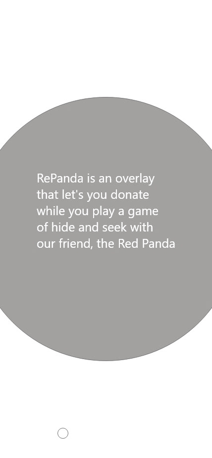
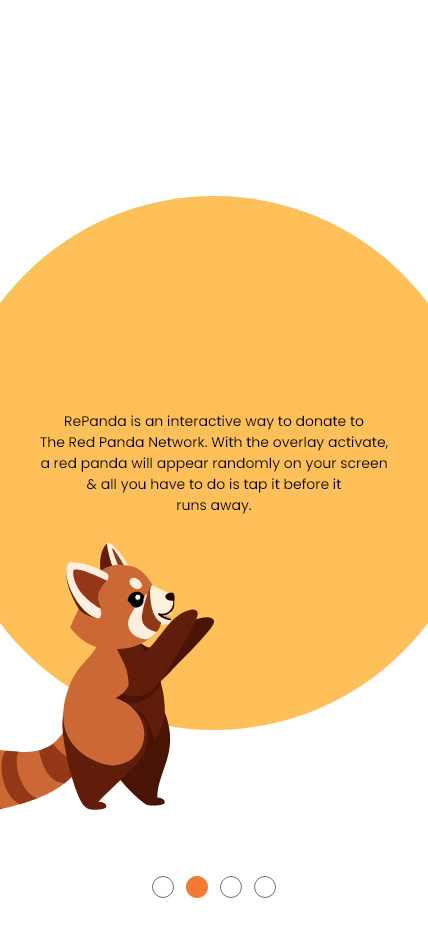
a project I worked on for the Google UX Design Professional Certificate, Repanda is an interactive way to donate to a red panda conservation. the project was imagined as a pitch to present to the red panda network in hopes of gaining a working partnership.
My Contributions
Lead ux designer
The Project
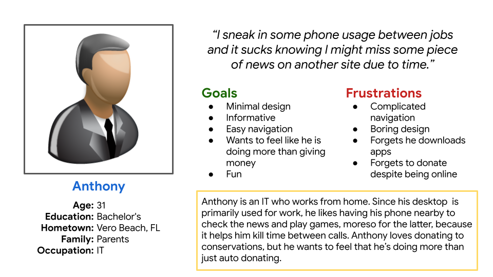
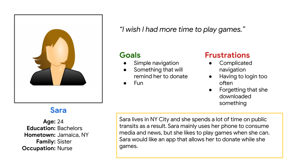
Repanda's target users are anyone who primarily uses their phone for browsing and who like to donate to conservation efforts.
Research showed that user enjoy playing mobile games, but they often forget about the ones they download due to browsing in short bursts. The same can be said for keeping up with news like their favorite conservation efforts and, by extension, donating to said efforts. The problem I needed to solve boiled down to a simple question: what can I make that combines the interactivity of games and that doubles as a donation platform?
The solution: create an interactive overlay that works in tandem with browsing and an accompanying site that advertises the app.
Research Study plan
Design
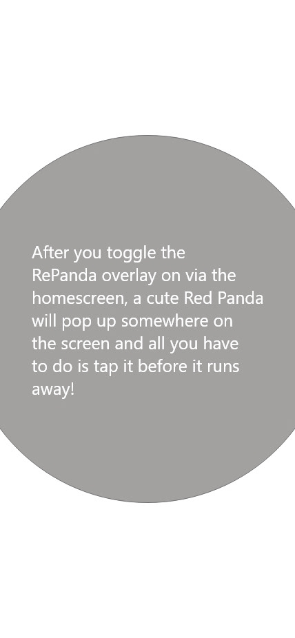
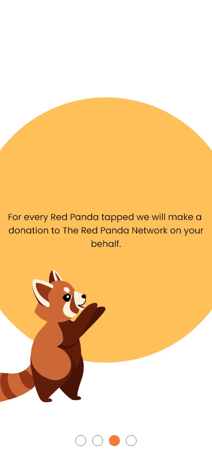
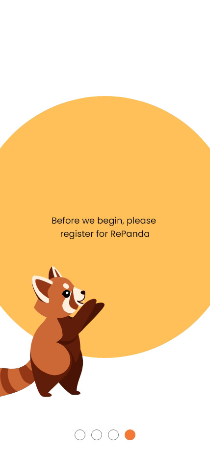
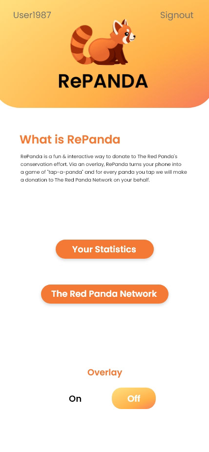
the main crux for our users is time constraint, SO My goal with the Repanda was to keep EVERYTHING simple SO INFORMATION CAN BE SKIMMED AND THE OVERLAY ACTIVATED QUICKLY.
The app
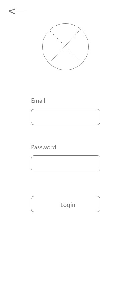
I decided it would be best to have the app simply be a tool and that any information pertaining to its finer details, like what it does, should be saved for the site. another thing that drove this decision is that the app is a very specific thing, so anyone who downloads it will already know what it's about because they sought it out.
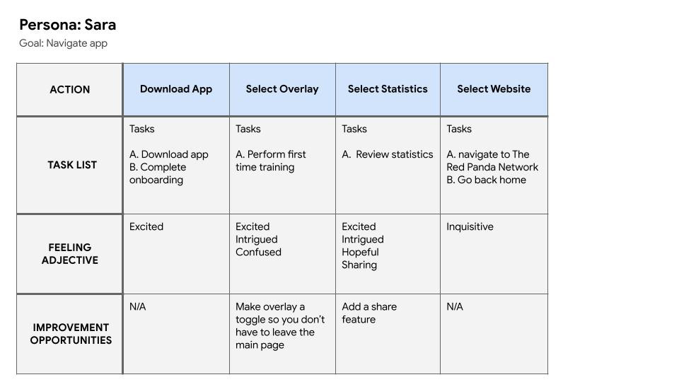
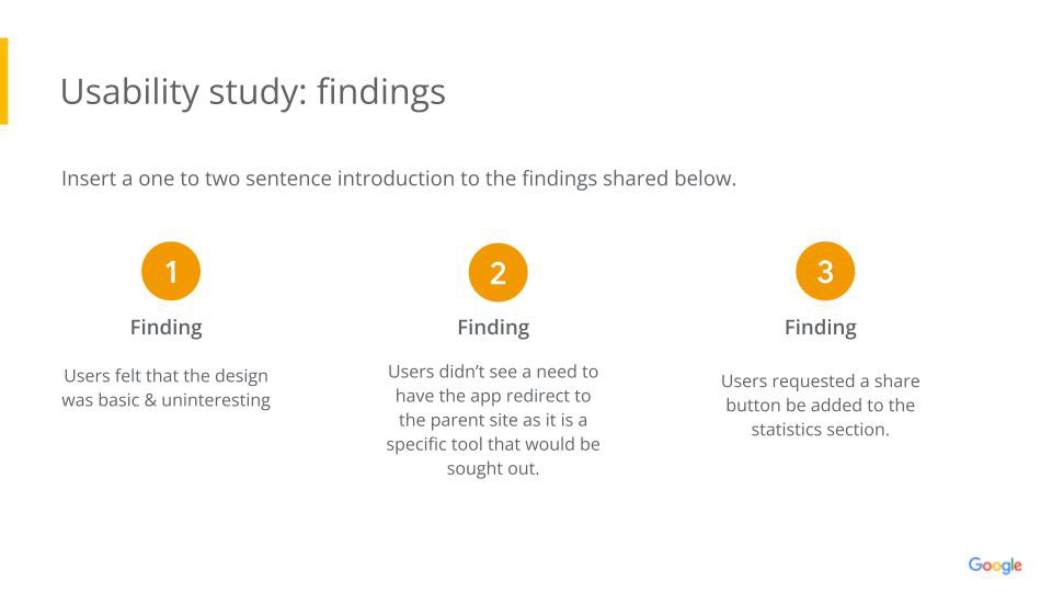
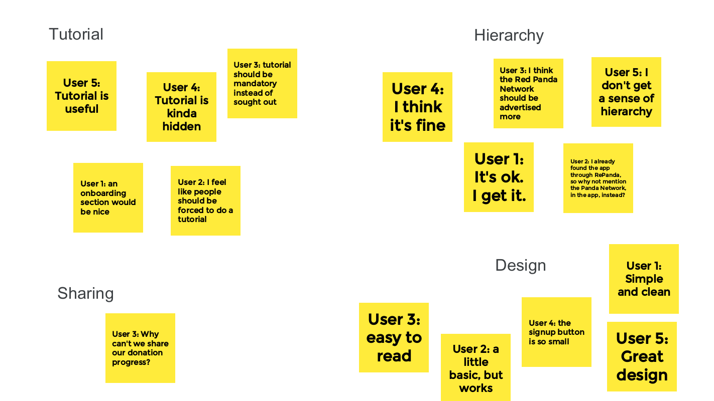
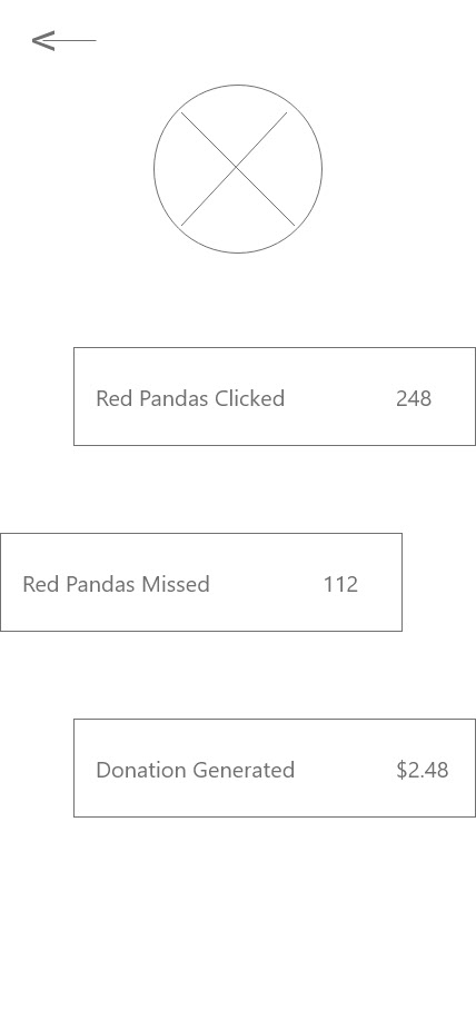
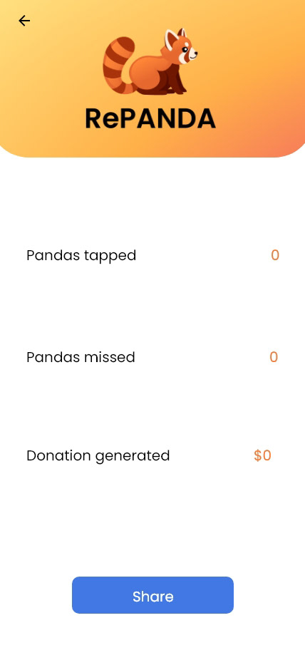
uSER TESTING SHOWED THAT THE APP COULD BE MADE EVEN SIMPLER BY REMOVING THE LINK TO THE MAIN REPANDA SITE AND ADDING A BLURB ABOUT WHAT REPANDA IS INSTEAD; THAT A TUTORIAL COULD BE ADDED TO THE ONBOARDING PROCESS; AND THAT ADDING THE ABILITY TO SHARE STATISTICS WAS STRONGLY DESIRED.
uSER TESTING SHOWED THAT THE APP COULD BE MADE EVEN SIMPLER BY REMOVING THE LINK TO THE MAIN REPANDA SITE AND ADDING A BLURB ABOUT WHAT REPANDA IS INSTEAD; THAT A TUTORIAL COULD BE ADDED TO THE ONBOARDING PROCESS; AND THAT ADDING THE ABILITY TO SHARE STATISTICS WAS STRONGLY DESIRED.
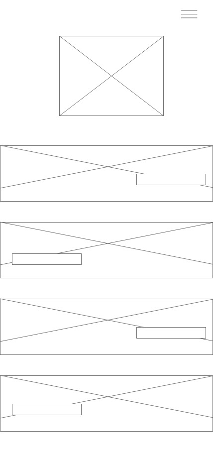
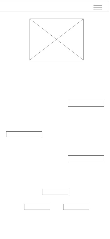


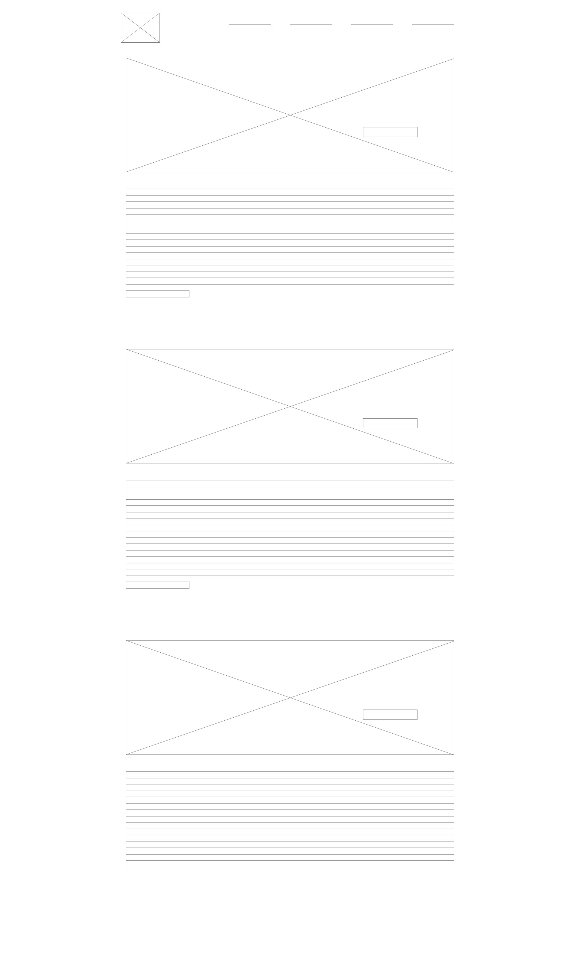
lOW FIDELITY DESIGN


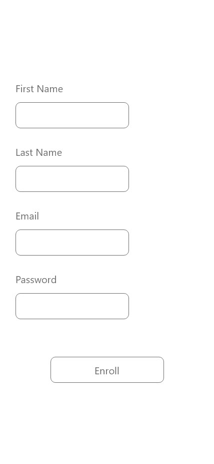

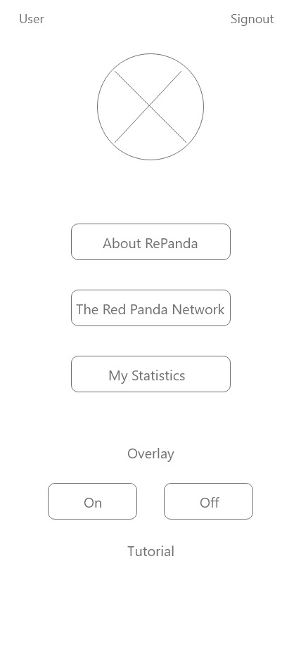


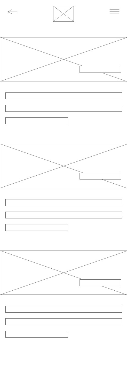
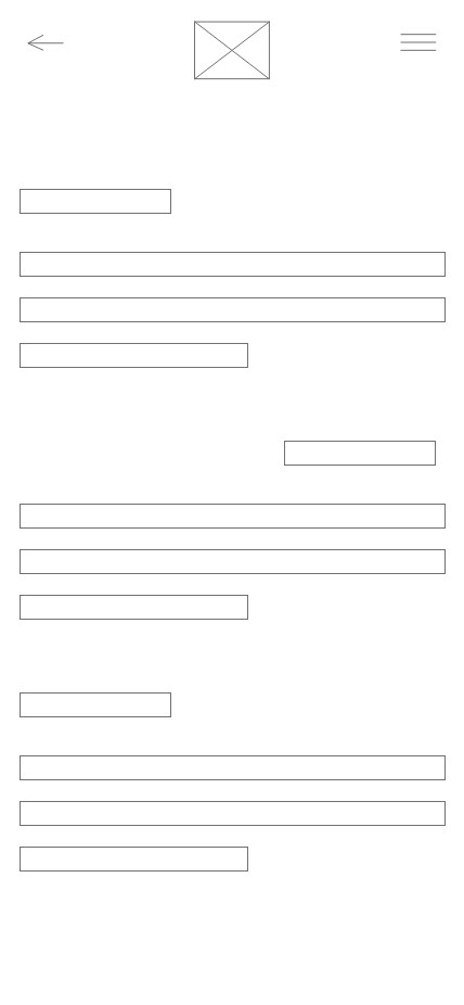
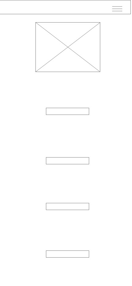
fINAL aPP DESIGN


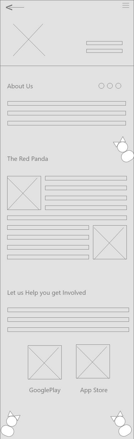
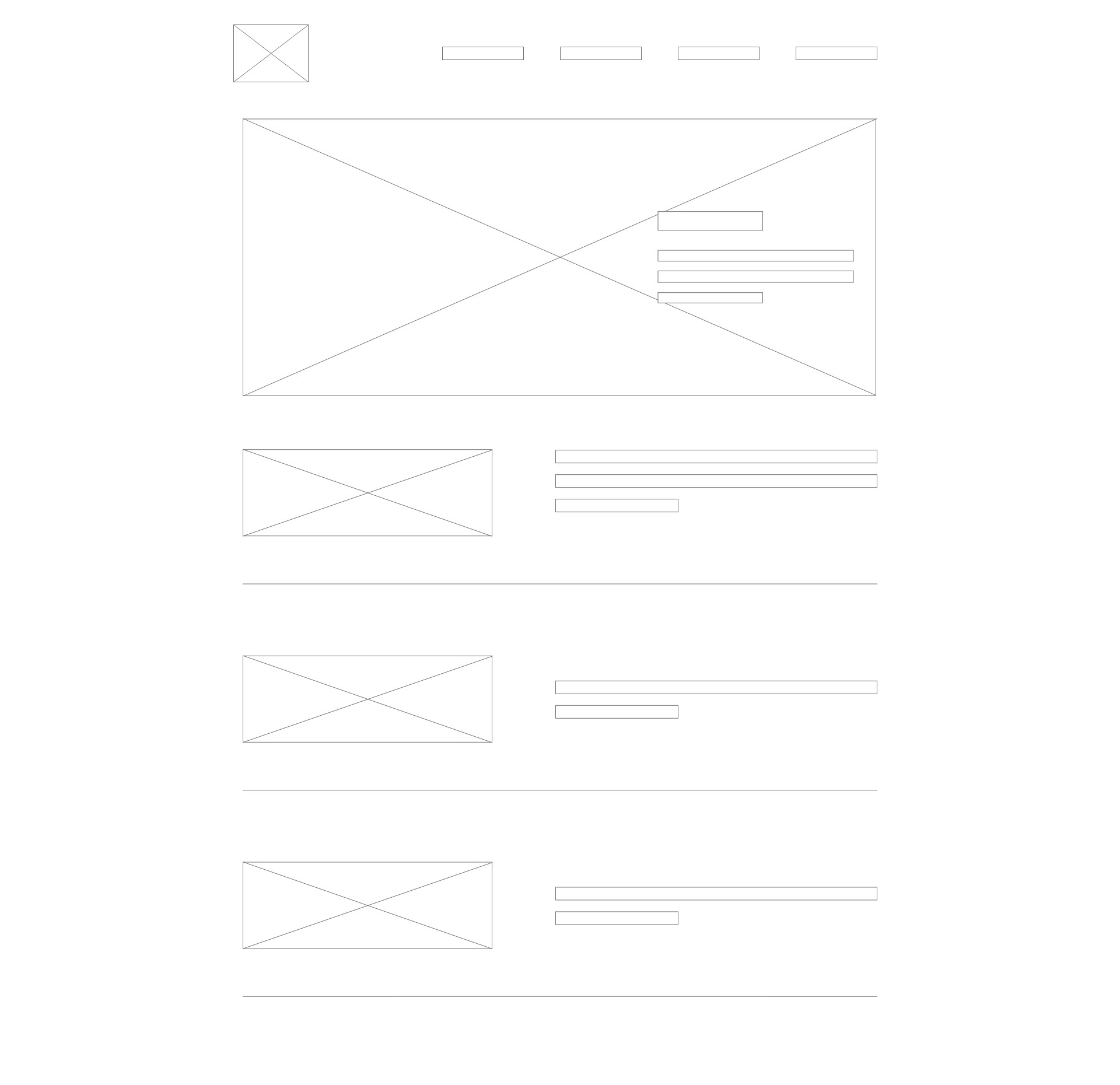
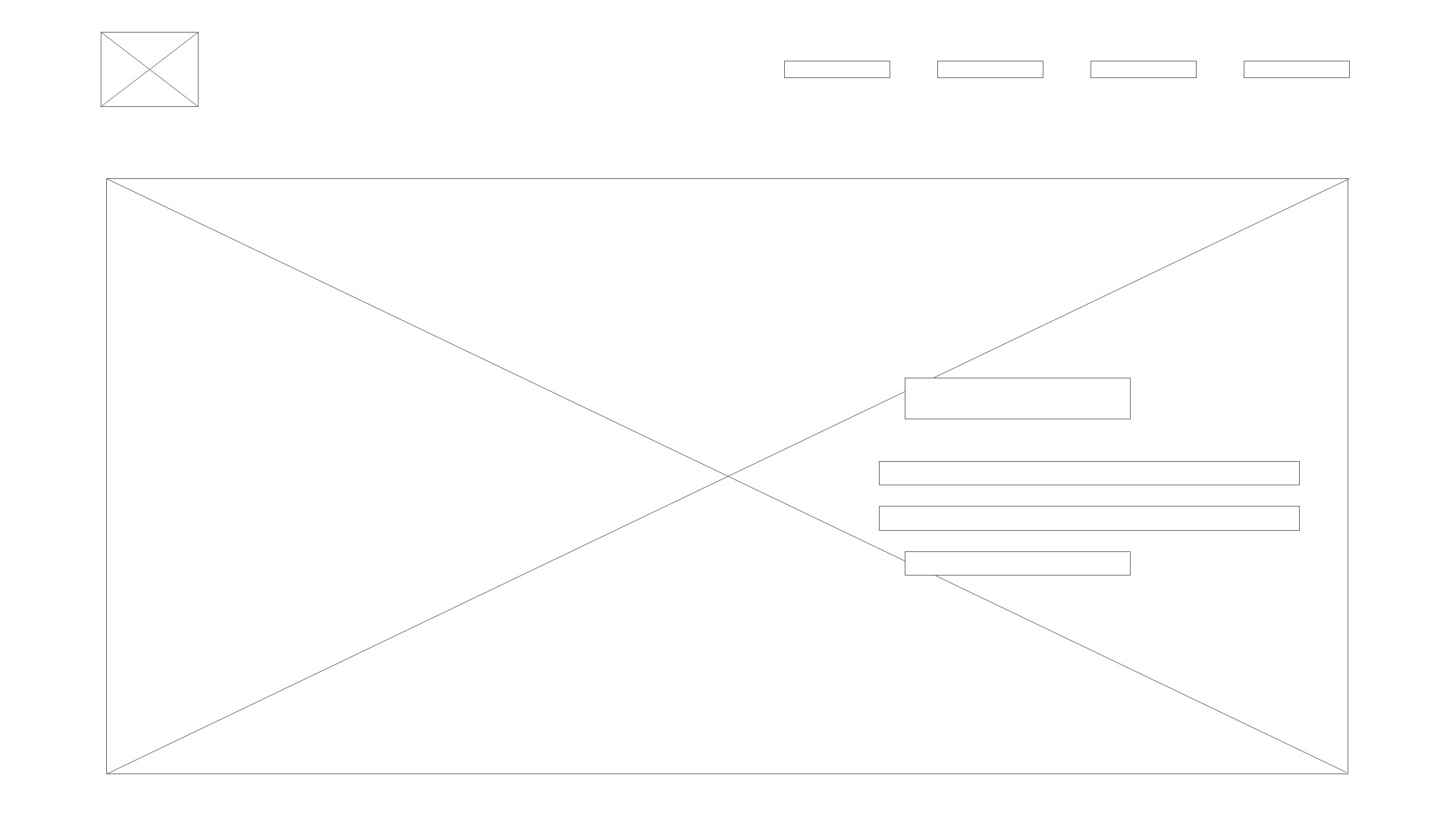
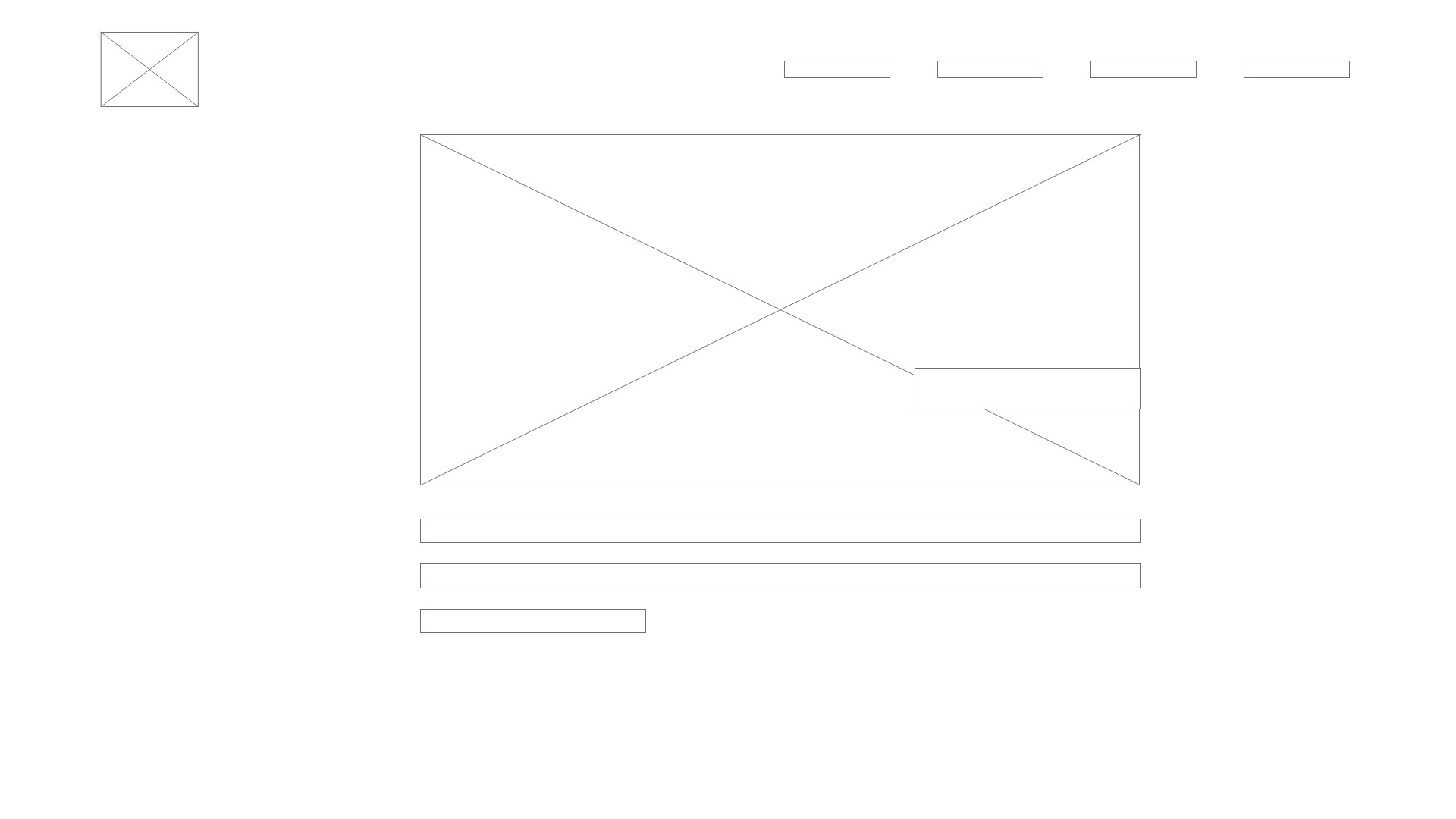
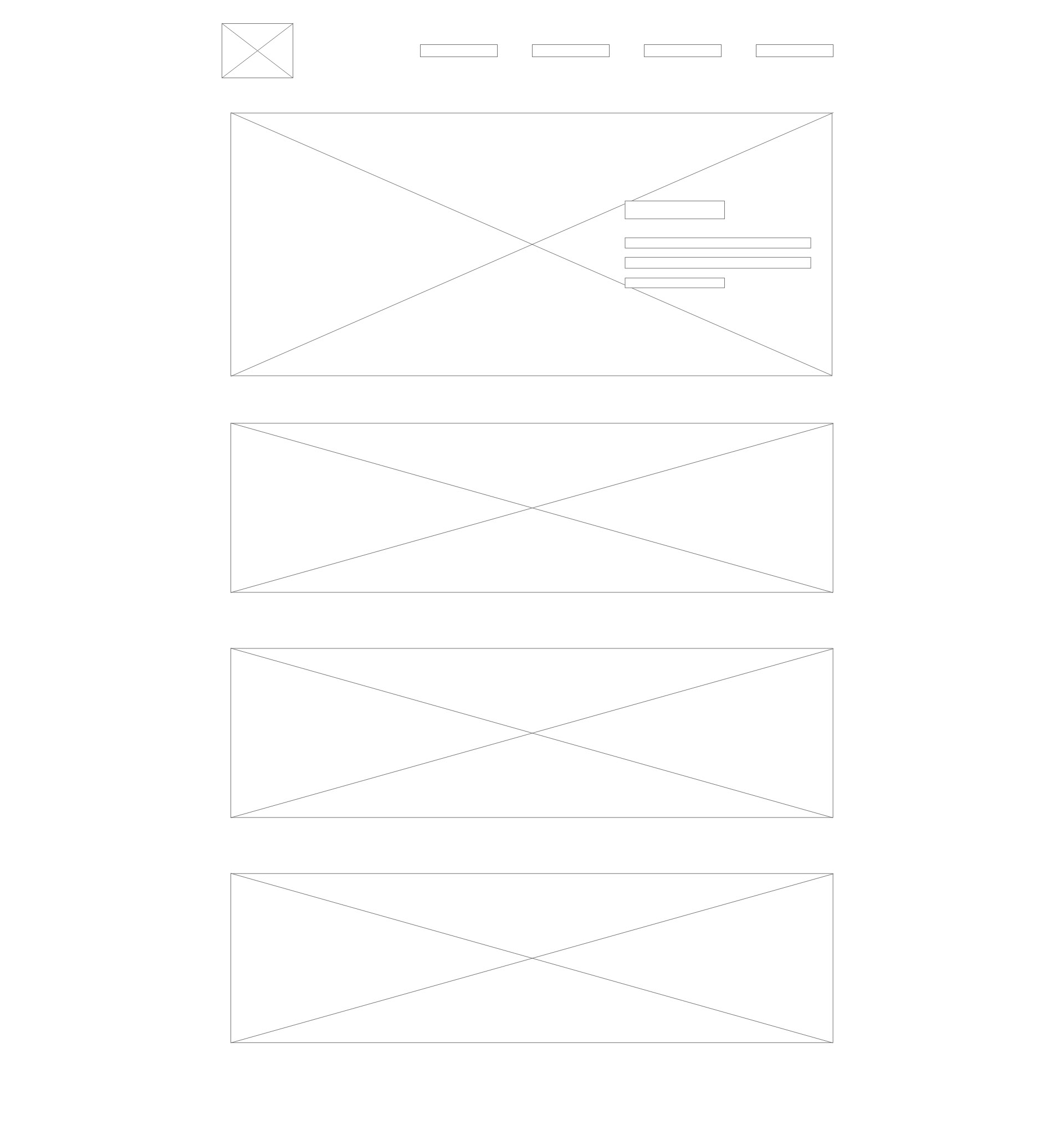
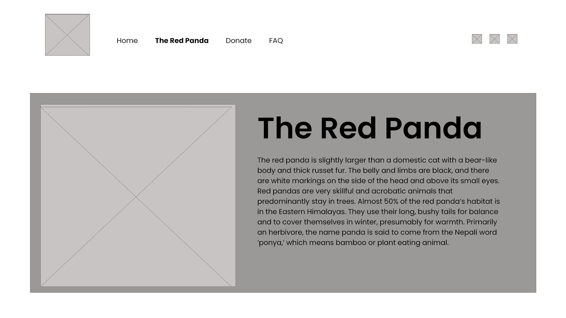
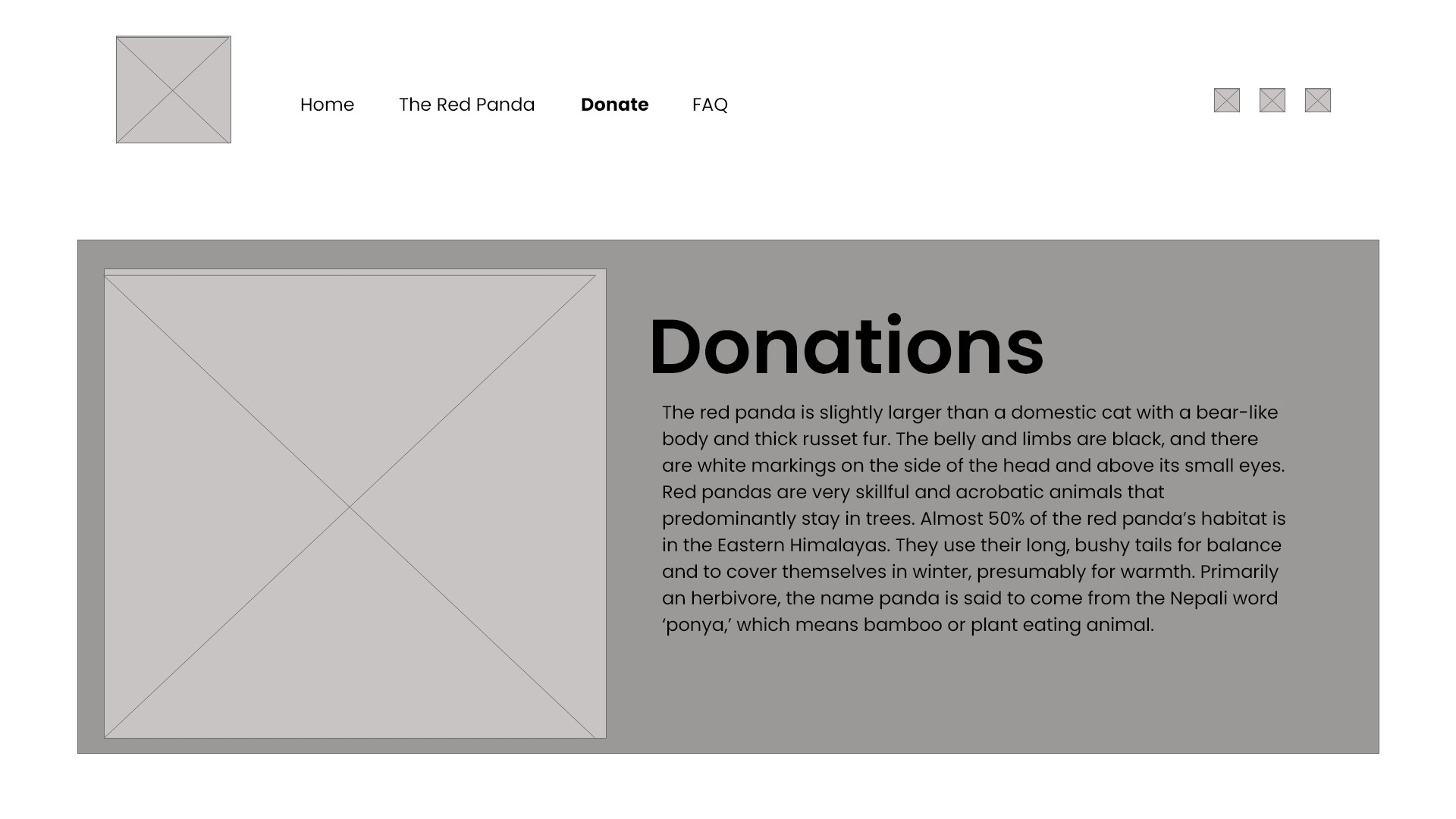
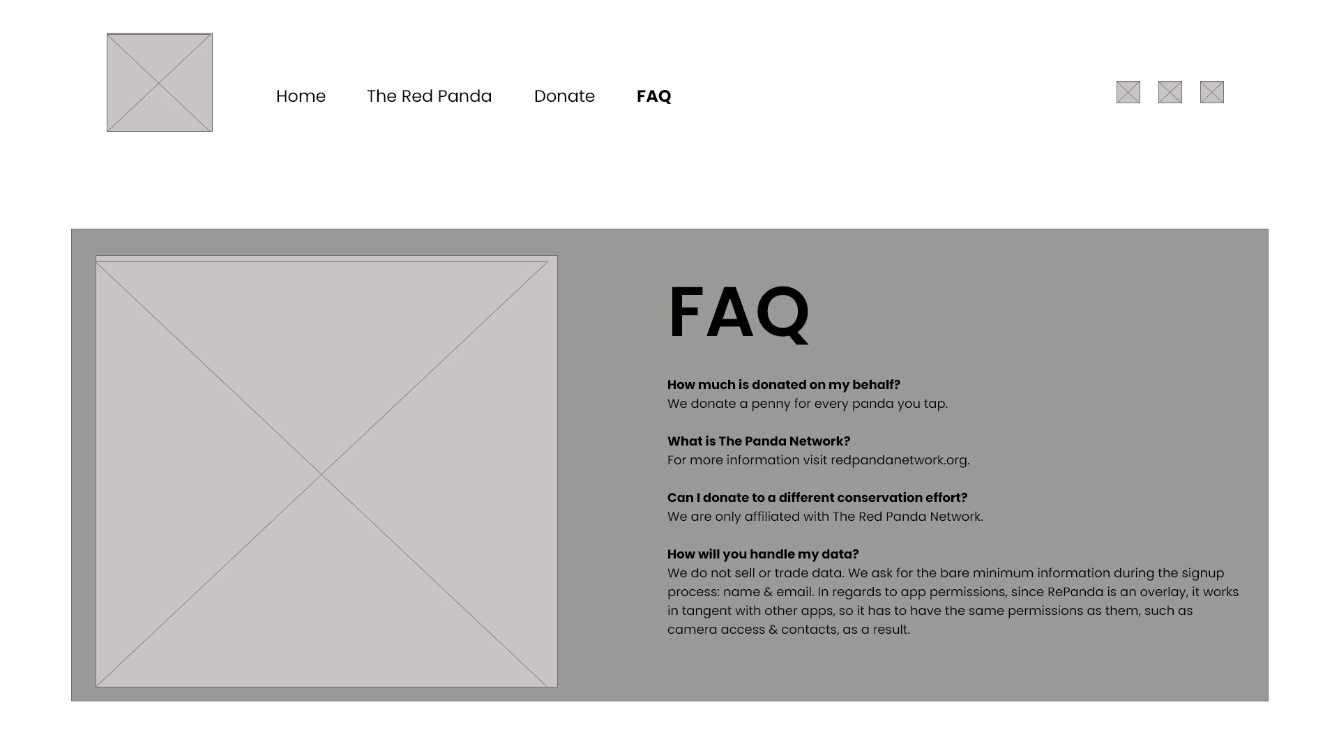
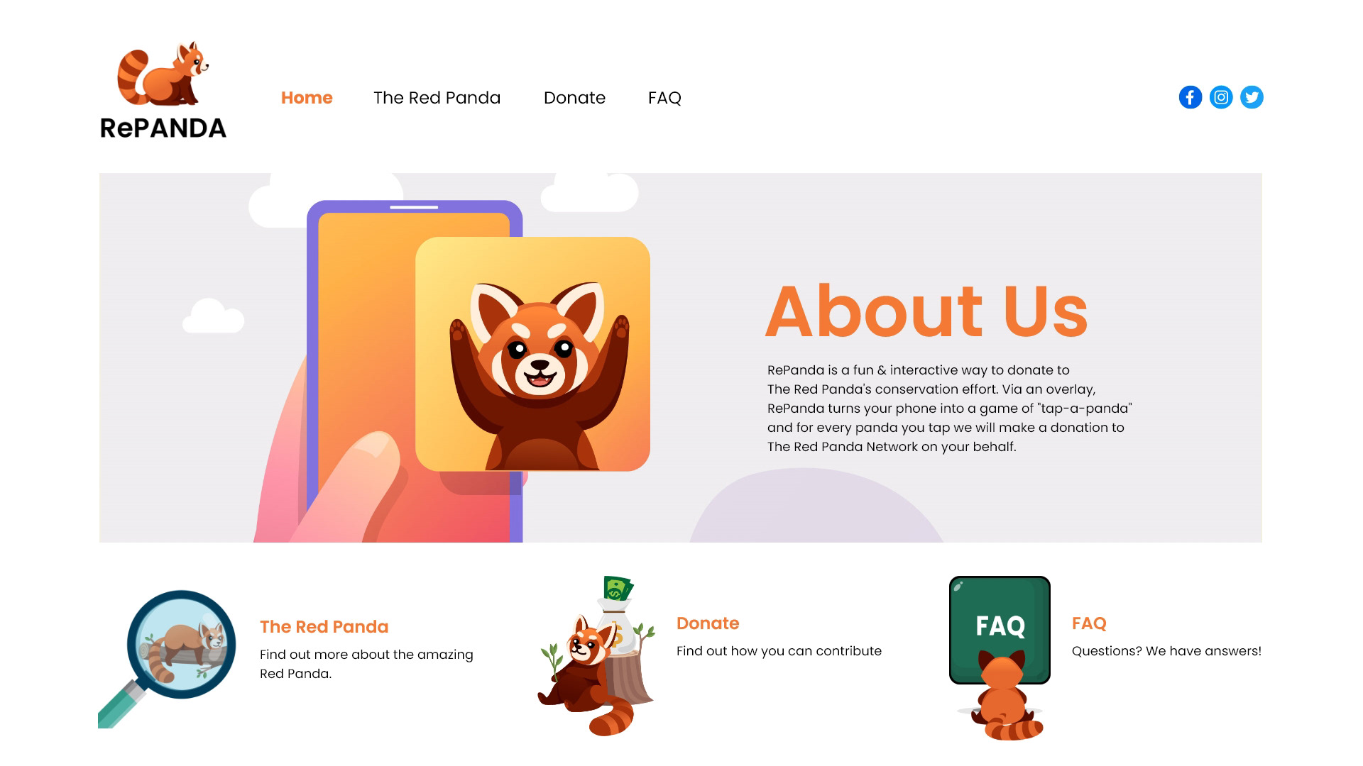
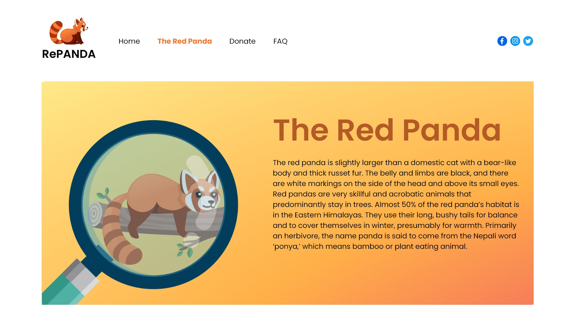
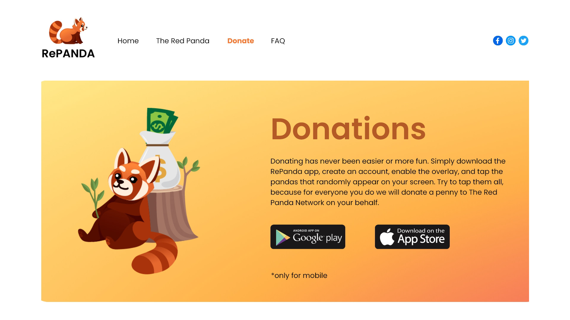
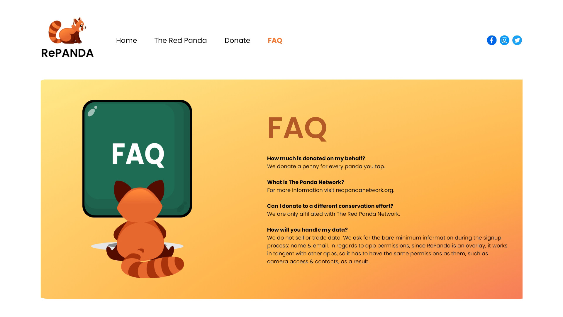
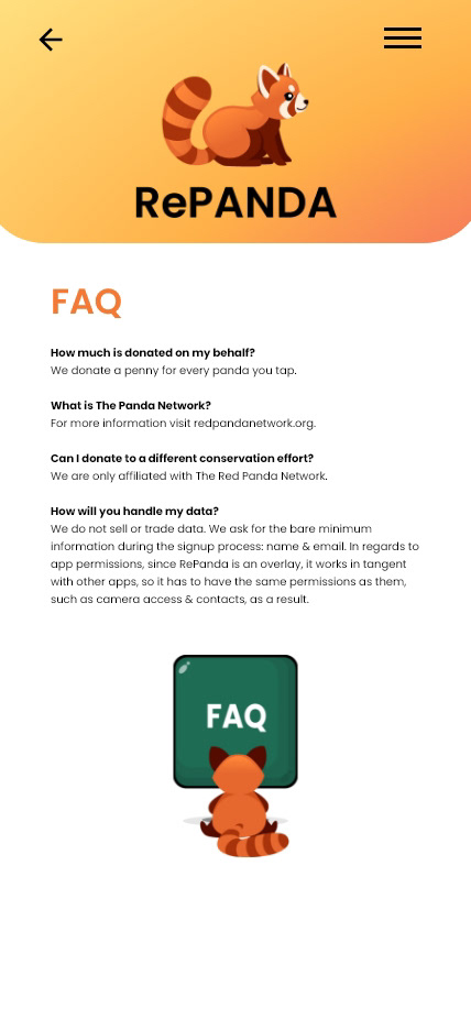
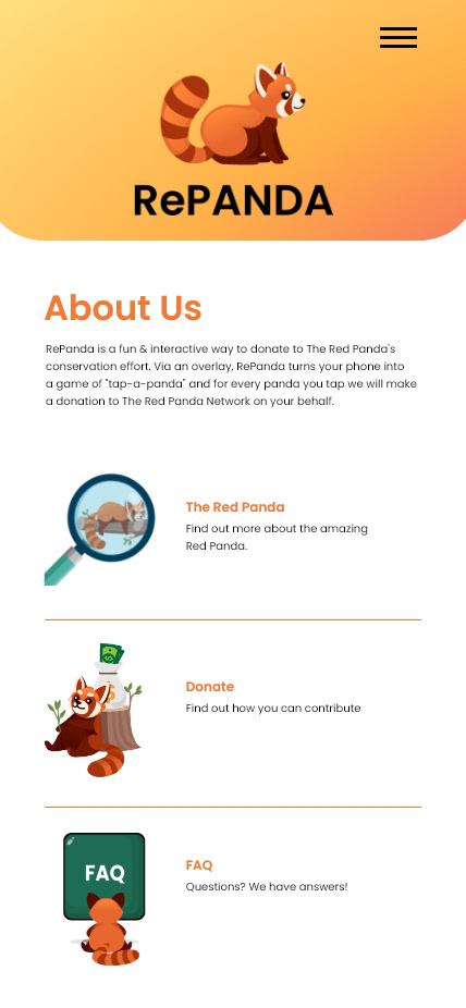
The Site
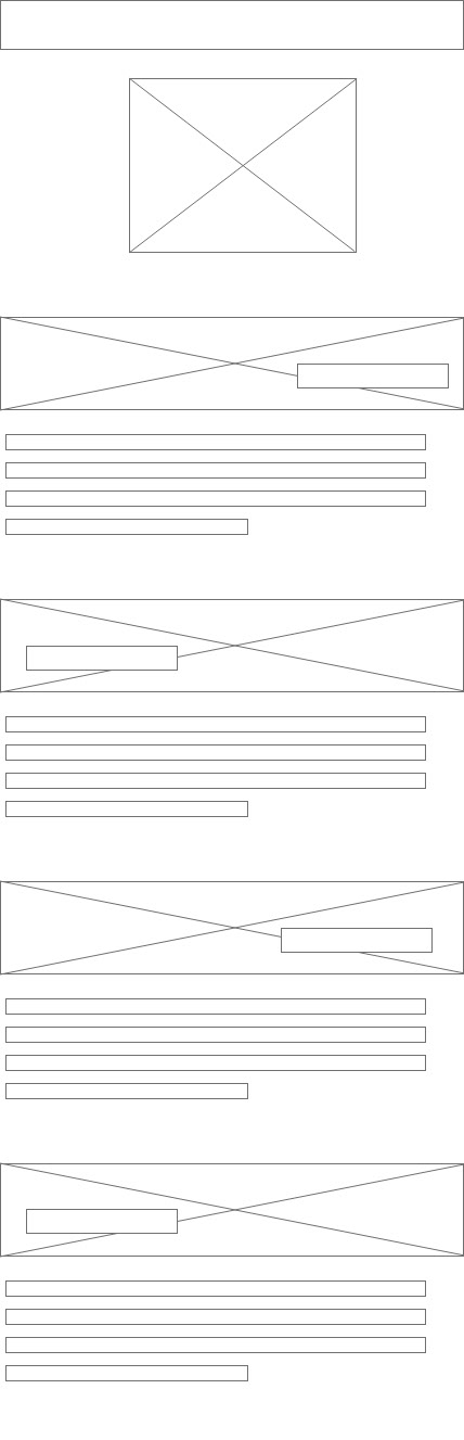
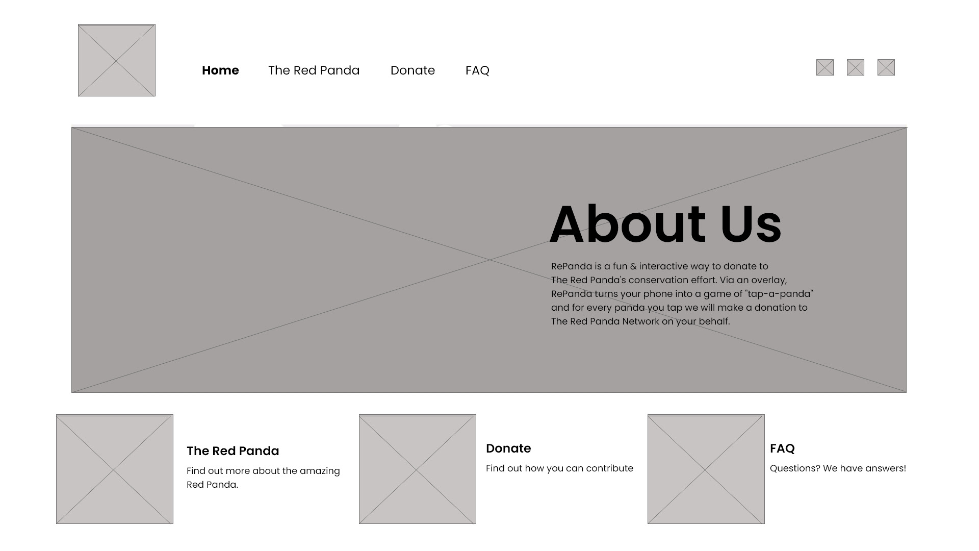
The site contains all information pertaining to the app in a simple, easy to read design. To ensure simplicity, I kept all information and graphics above the fold, so no scrolling or "searching" is necessary.
INITIAL USER TESTING WAS FAVORABLE AND THE SITE DID NOT HAVE TO BE CHANGED.
INITIAL USER TESTING WAS FAVORABLE AND THE SITE DID NOT HAVE TO BE CHANGED.
SiteMap

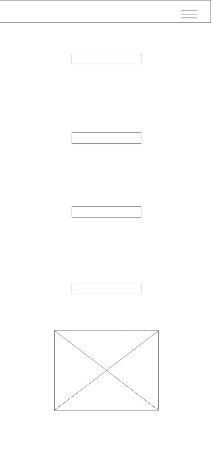
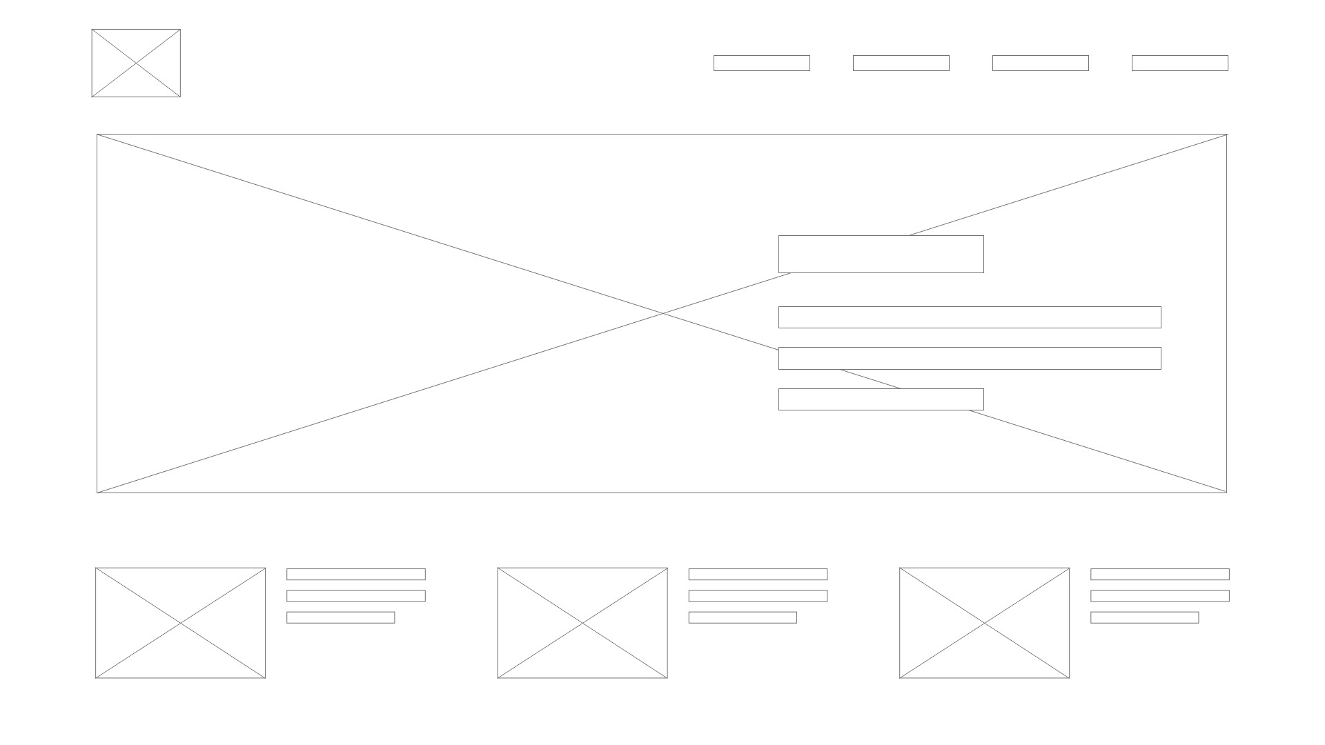
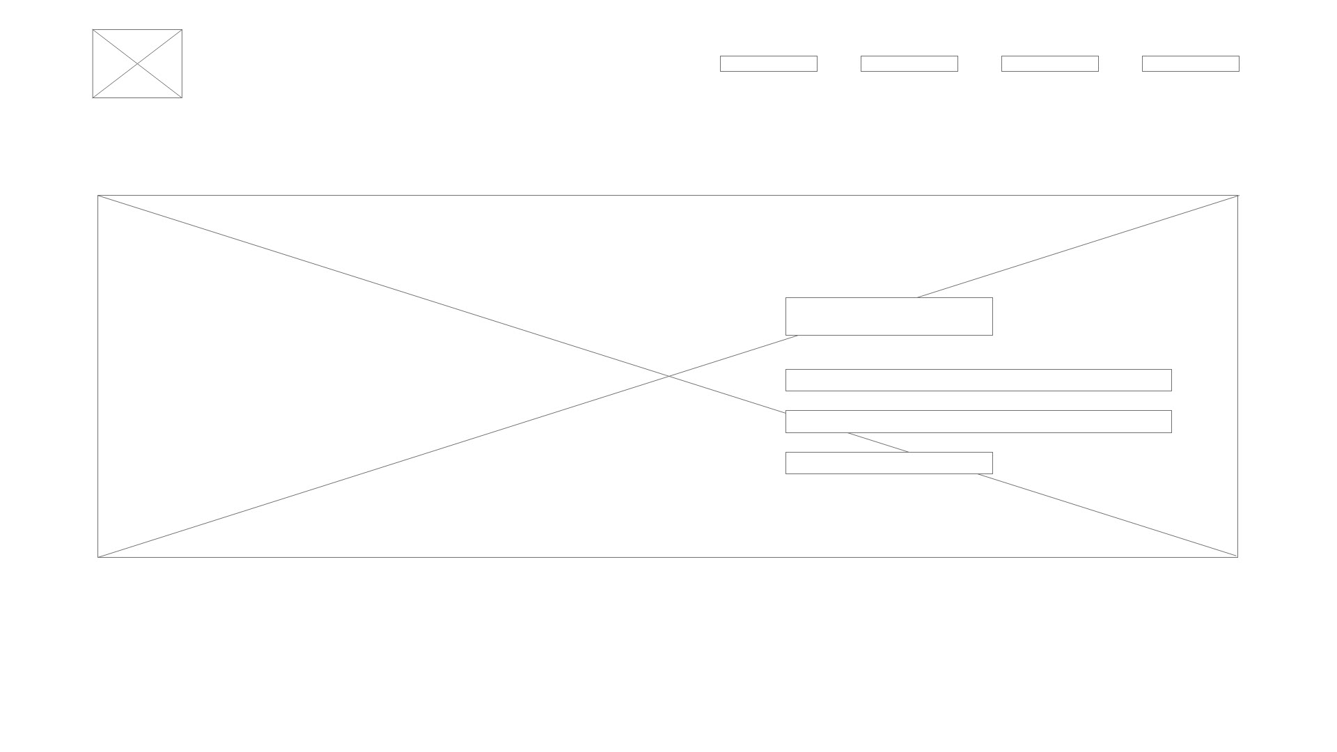
Low fidelity
FINAL SITE DESIGN
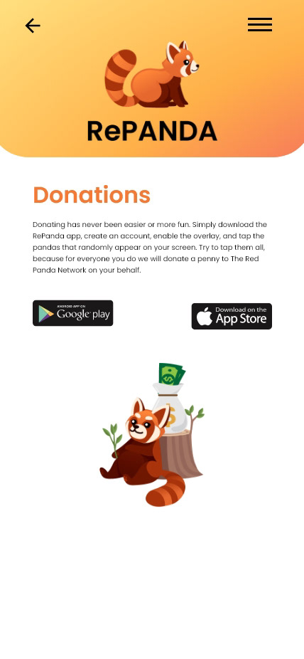
Responsive site

Takeaways
This project taught me that less is more and that users, more often than not, want something that is easy to navigate and to the point.
